Manage Your Positions and MtM Reporting
Along with the excel, there is a power BI for the Mark-to-Market reports. There are four tabs which display the underlying data.
Below is a screen shot of the Power MtM report.
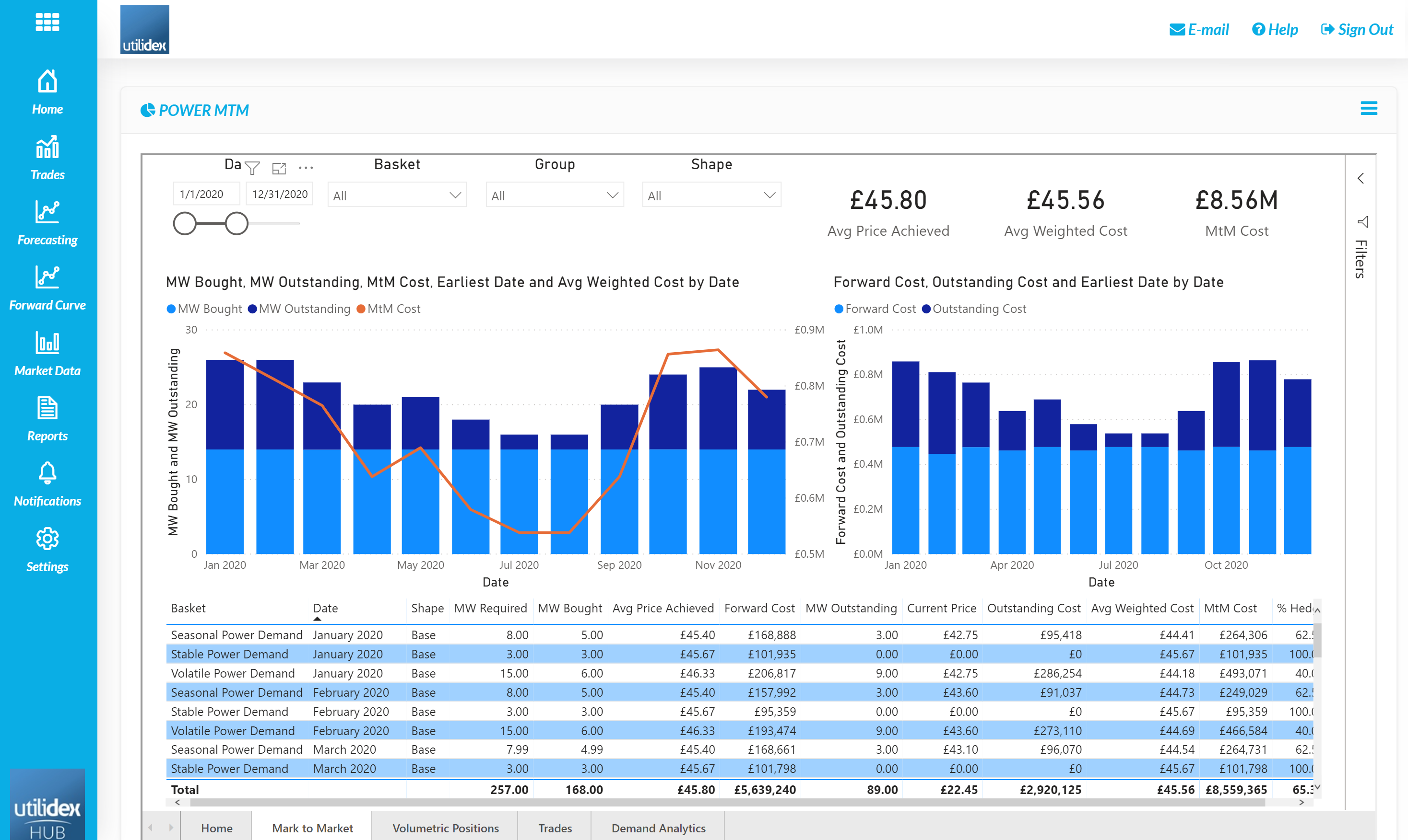
This report values the entire position as well as displays the Avg. Price Achieved and the Weighted Avg. Price of the commodity. The report can be customised to allow for analysis on individual baskets and custom date ranges. The report also contains data of the Volumetric Positions:
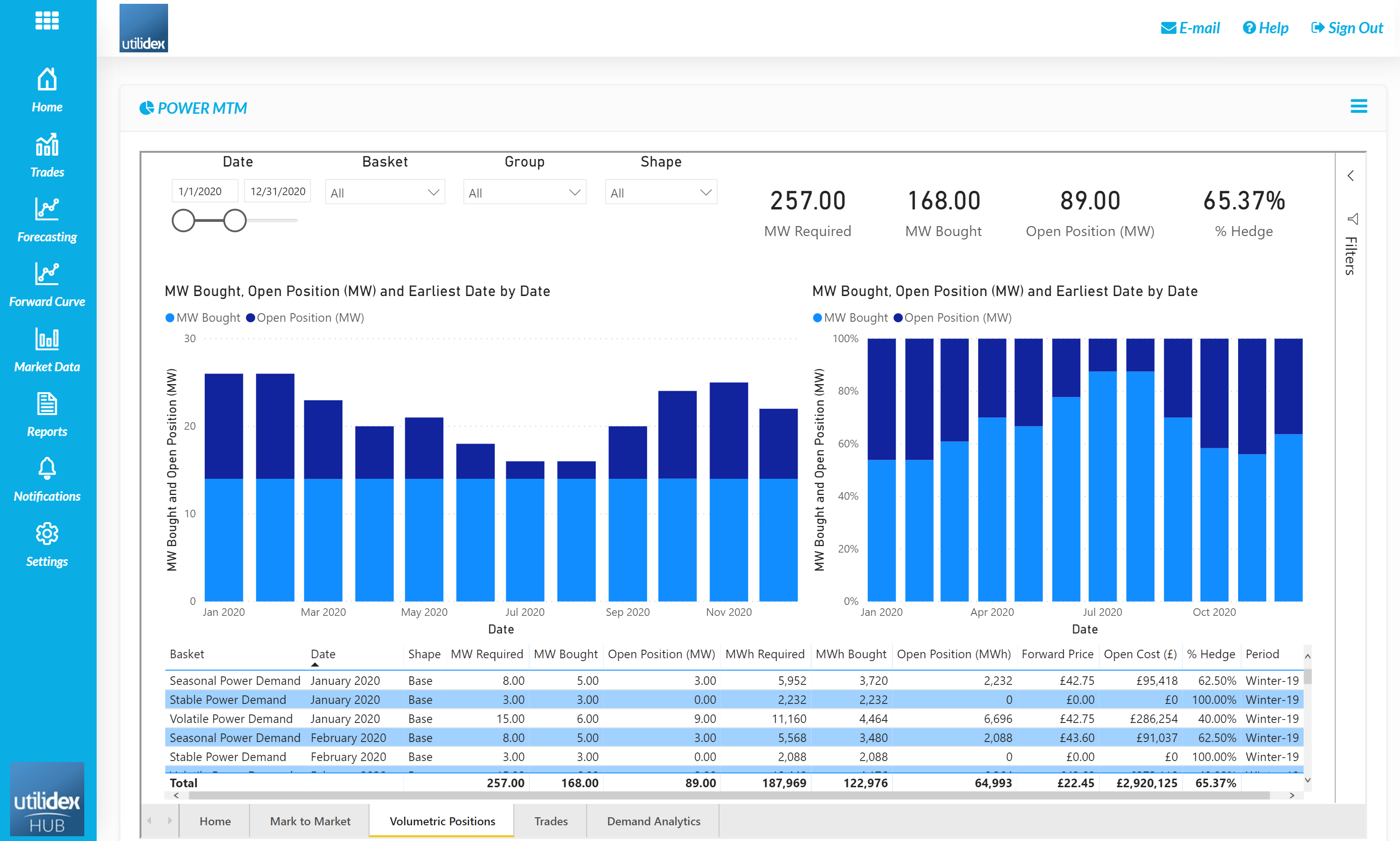
On this tab, the open volume for each volume is analysed. Users can view both the volumetric and percentage hedged for each basket over time. Users can view both base and peak together or individually for additional analysis.
The report displays the underlying data which runs the BI, users can also view their trades within the Trades tab.

This allows for users to cross check the data in the reports.
Finally, users can perform Demand Analytics on their purchase requirements to understand any seasonality or split between base and peak load baskets.
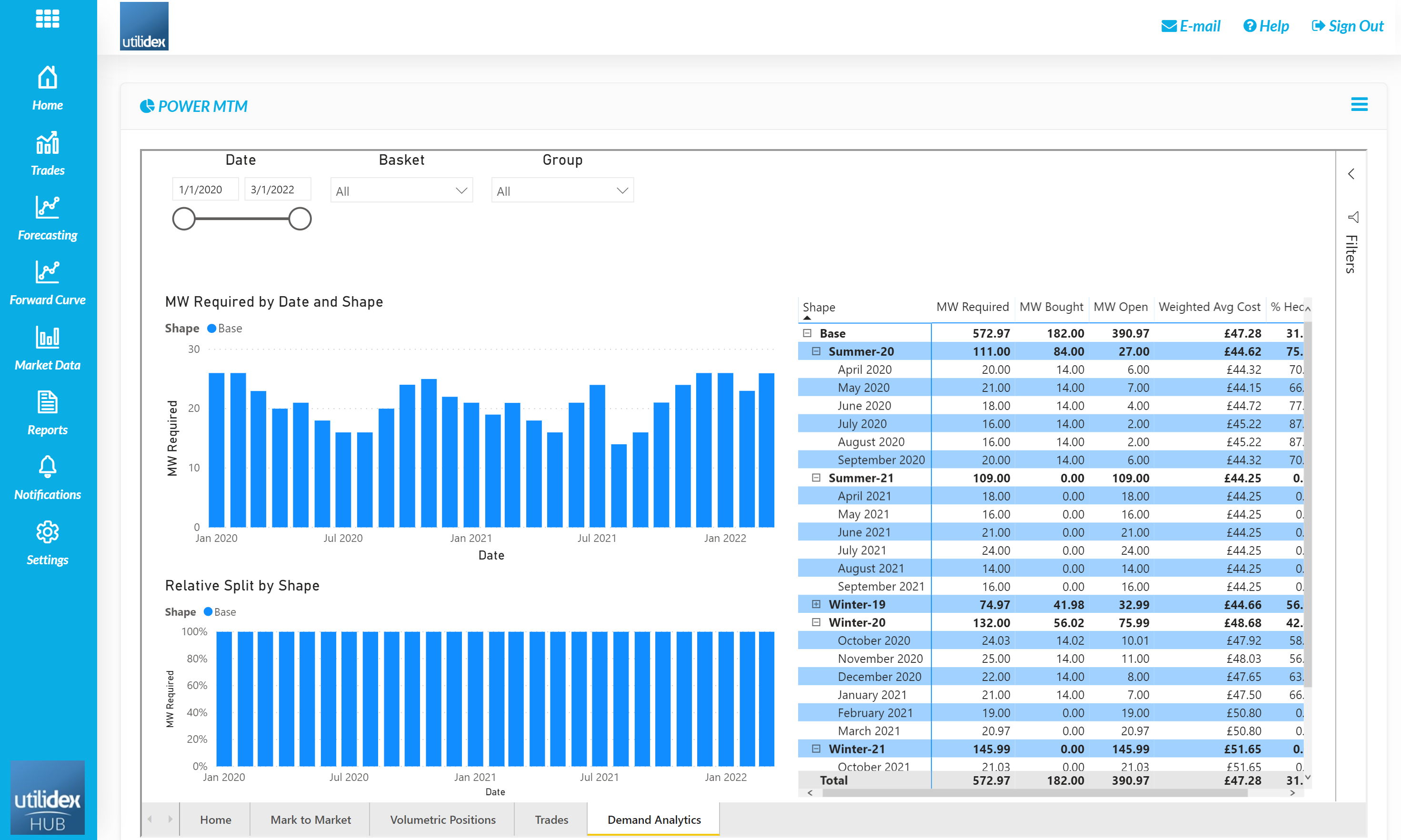
The demand analytics tab displays both the total volume and split between shapes for each basket. The report can be customised by date, and basket. The above screen shot contains demo data which only has Base demand.
Analysing Prices
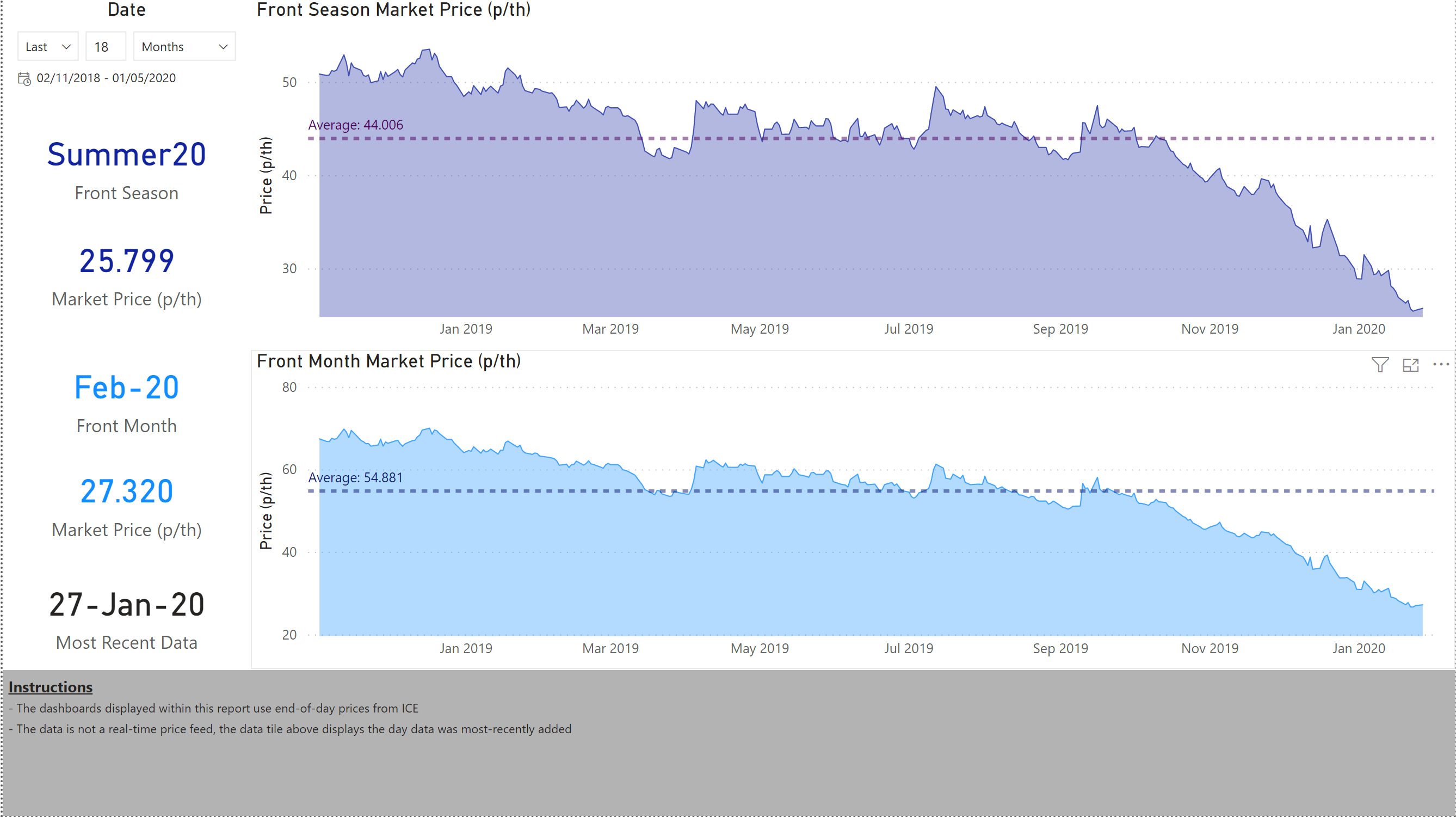
Users can also view Market Prices in Power BI. On the Current ICE Prices tab, users can view the prices and price history for the forward season and month as well as select individual strip-names to view their price history and a forward curve. On the Home Page users can change the date range to view the price history of the front season and front month. The price displayed on the left of the page is the most recent price. Users can also see the most recent date data was loaded into the system.
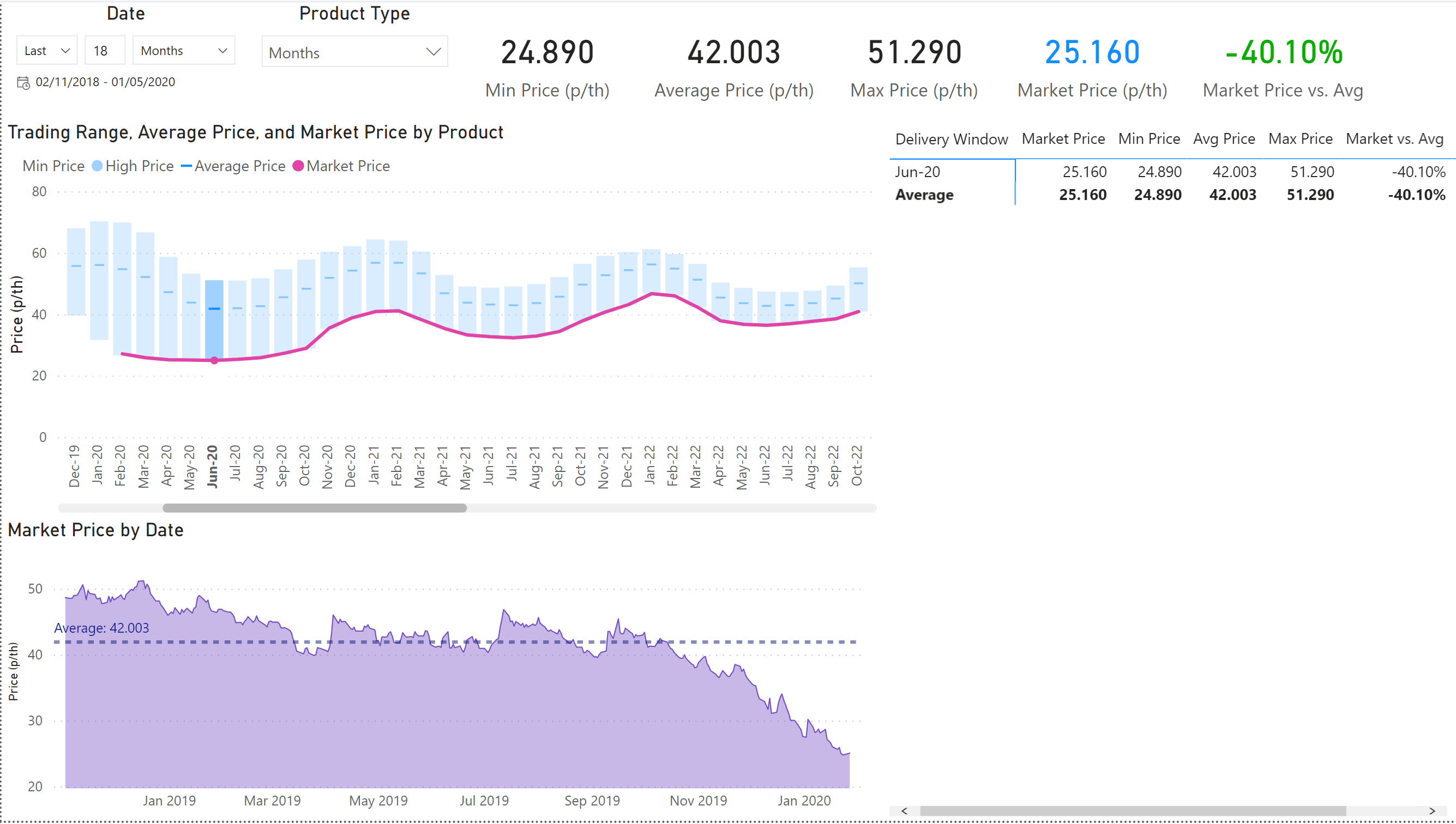
Users can also view a long-range view of the price curve in the Historical ICE Prices tab. The date range can be adjusted as well as the type of forward curve displayed (i.e. months vs. quarters vs. seasons). The page also displays the minimum, average, and maximum price over the configured period. The dashboard shows the current market price in the pink line as well as in the light blue KPI, the market price is also analysed against the average over the same time period.
Below the chart showing the forward curve, a user can view the price history of each contract by selecting the month in the chart above or within the table on the right.
With an additional subscription users can also view Spectron prices by going to Market Data & Spectron Prices.
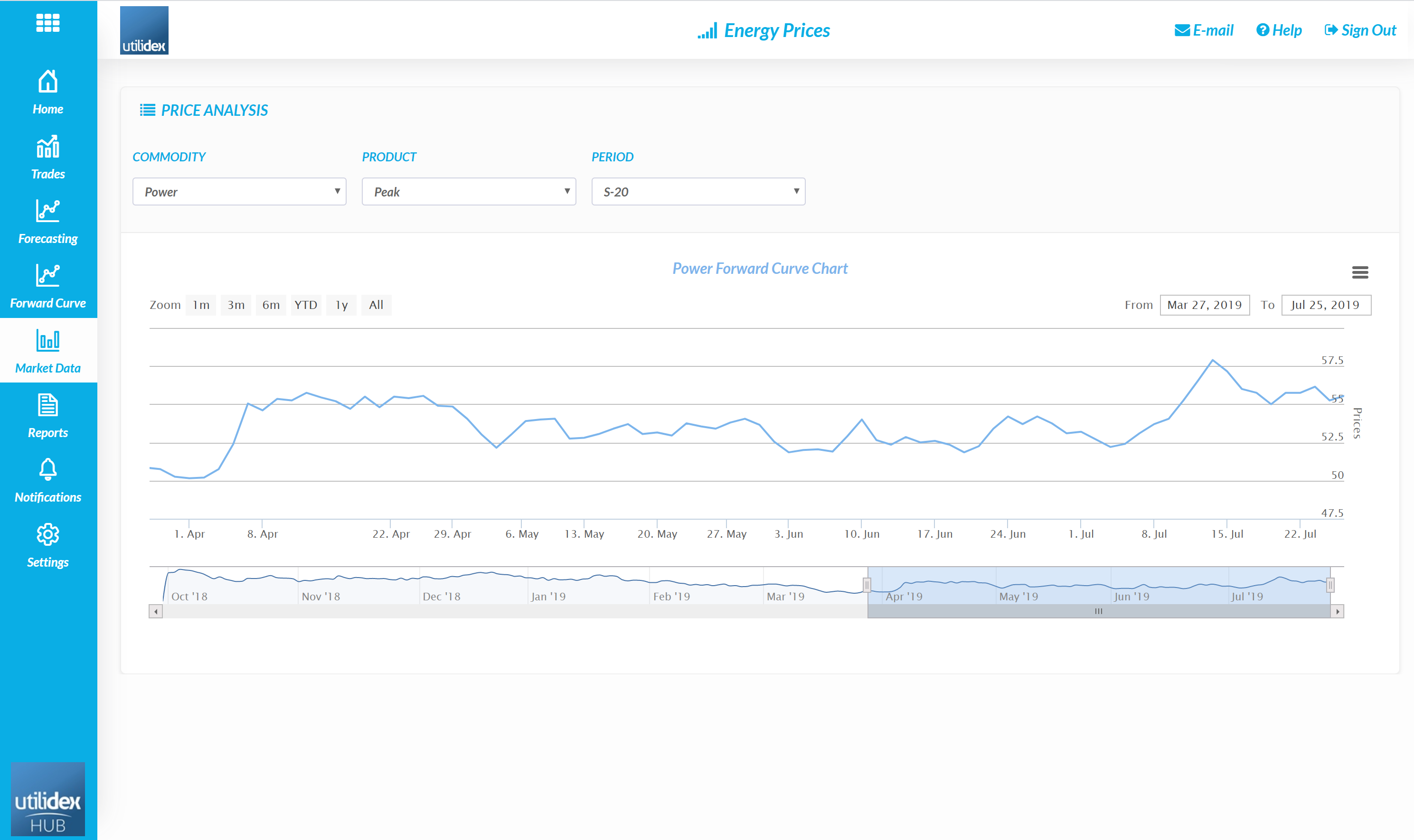
In this screen, users can select the commodity, product, and period for additional analysis.
Benchmarking Performance
Users can also use the Utilidex system to benchmark their performance. There is both a BI and excel report which allow for performance analysis against both the market and a pre-determined benchmark rate.
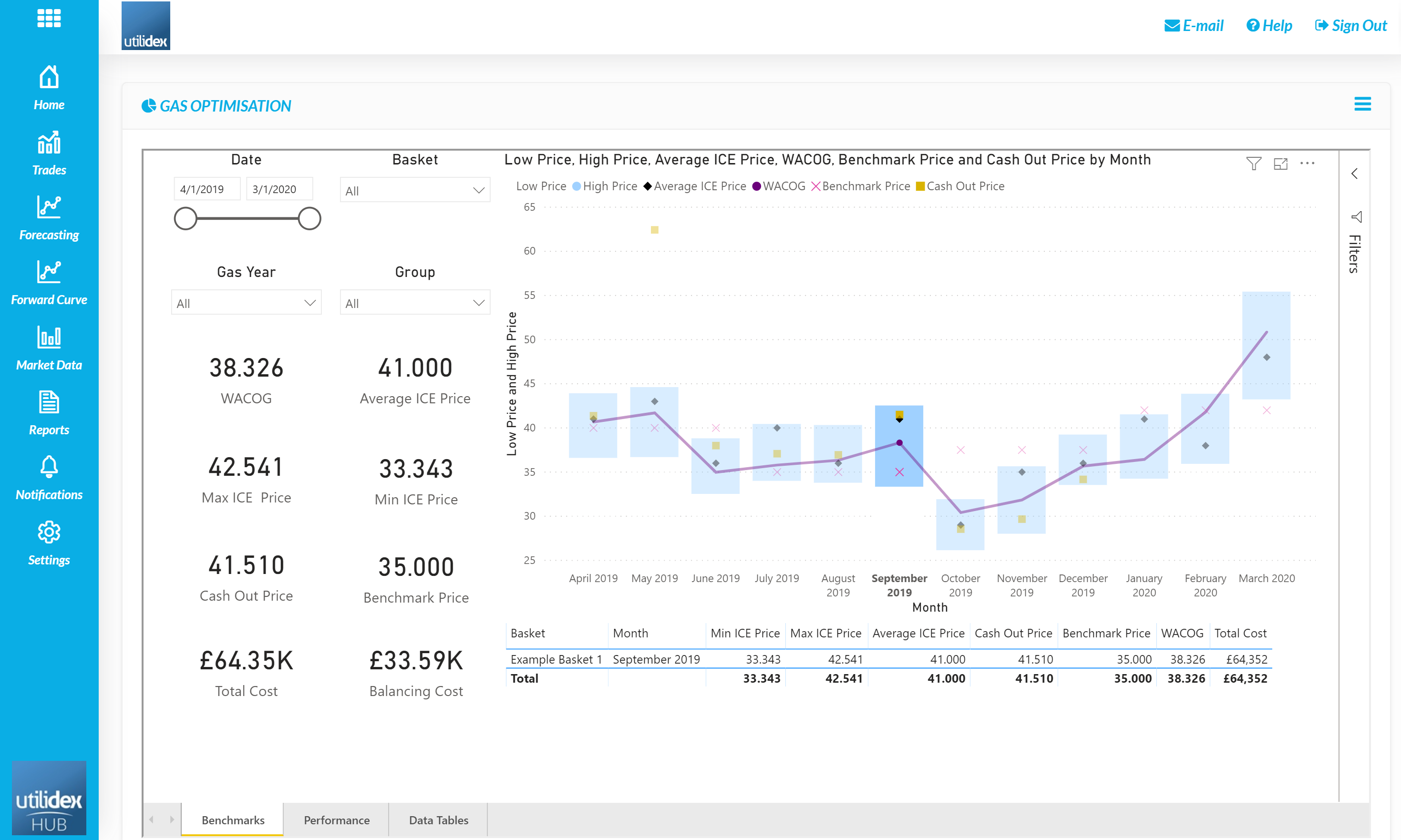
The above BI displays the Weighted Average Cost of Gas versus market benchmarks.
Users can also calculate a P&L (i.e. cost differences) using the achieved rate and benchmark or average price.
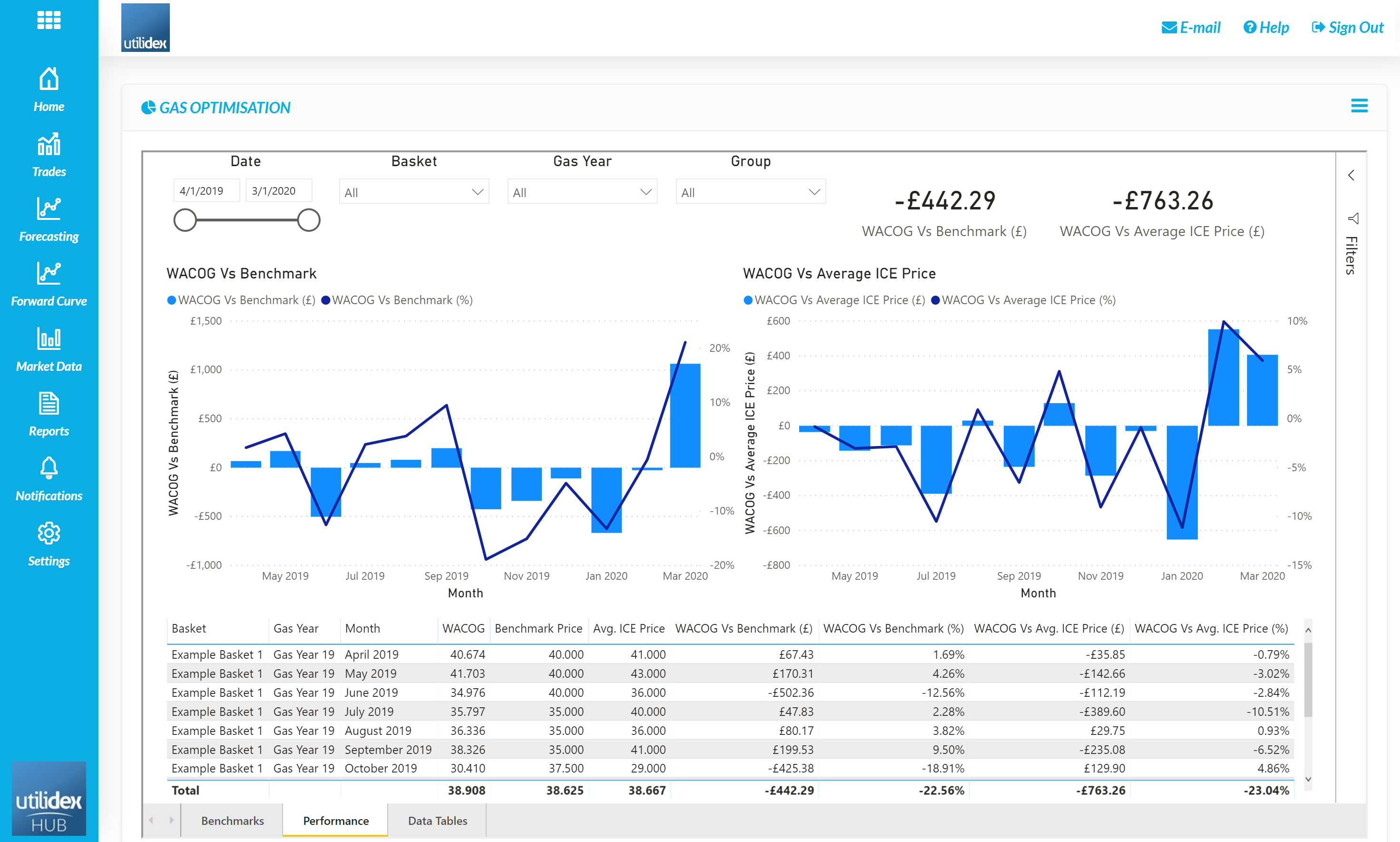
The above BI displays the total performance benchmark by month as well as a total, this can be displayed by fiscal year. The values are calculated by comparing the total cost vs. what this would have been if the benchmark price or average ICE price was achieved.