Accessing Data Analysis
Quickly view your half-hourly consumption overtime through interactive bar and area charts. Navigate to your site list by clicking Sites >> View Site List >> Click on View in the Data Analysis column.
(fig a)
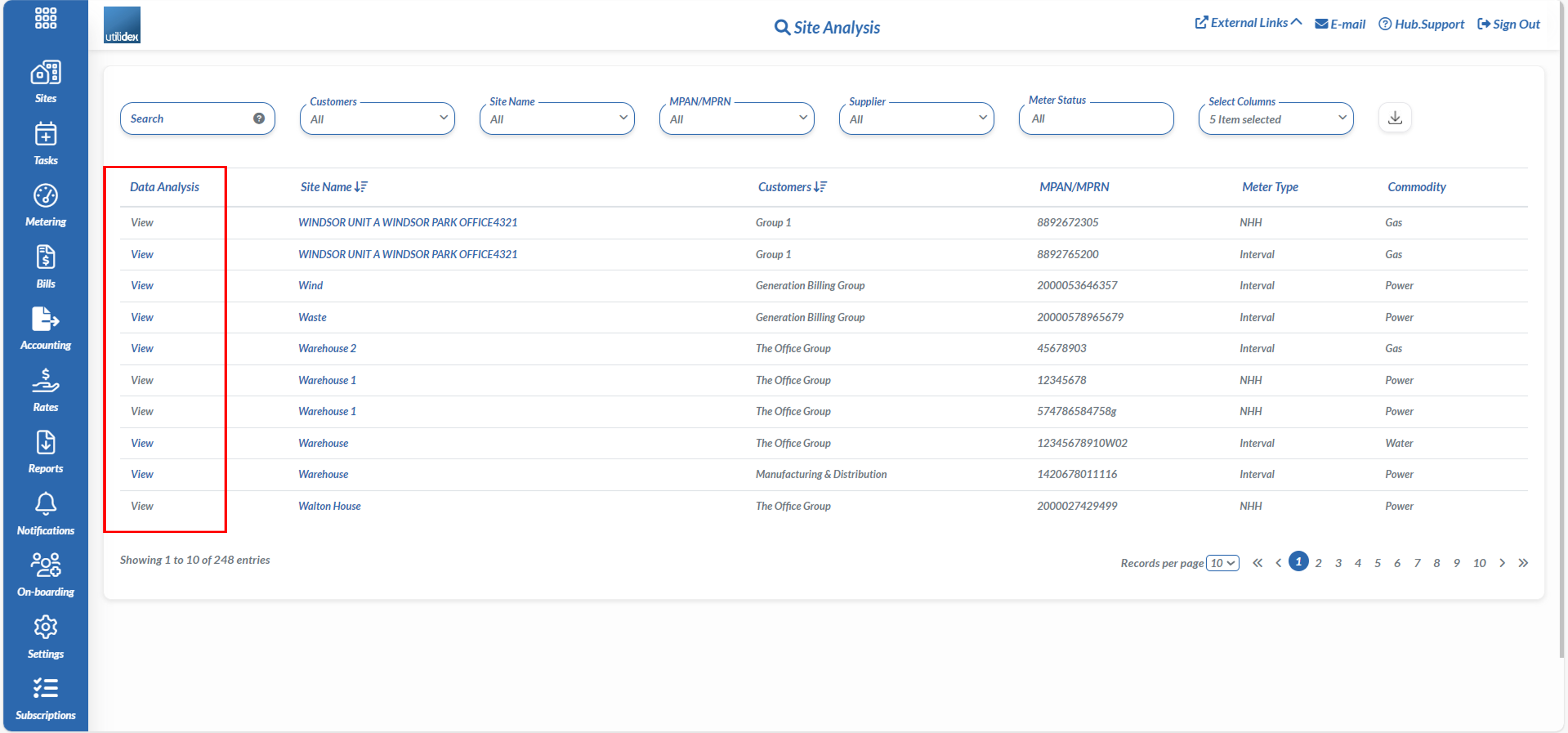
To note, the Data Analysis page only displays half-hourly (HH) data. The View button will only be accessible for HH meters and all non-interval meters will be greyed out. To change the meter type, navigate to your site list via the CRM or multiple site list and update the Meter Type.
Once you have clicked on View you will be prompted to the Consumption Analysis page.
(fig b)
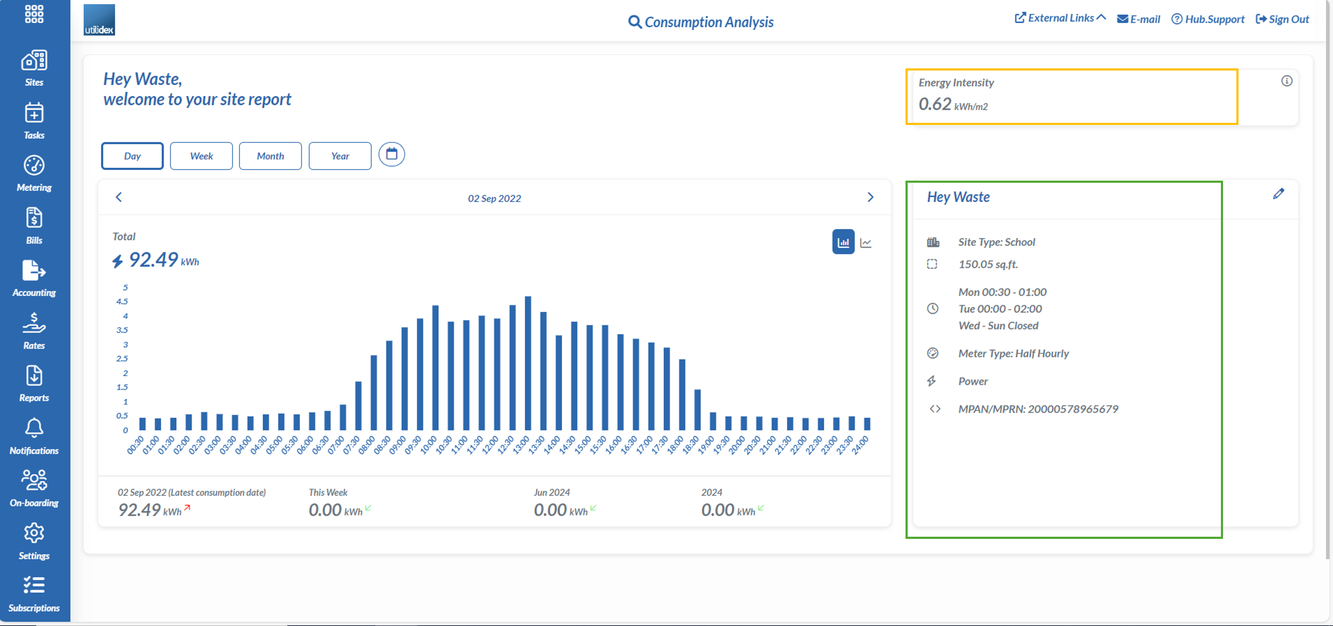
Green – Displays key site details including site name, site type, site area, MPAN/MPRN, meter type and commodity
Orange – Shows the energy intensity of the meter. This is calculated by the area of the meter divided by the total consumption
(fig c)
Filtering
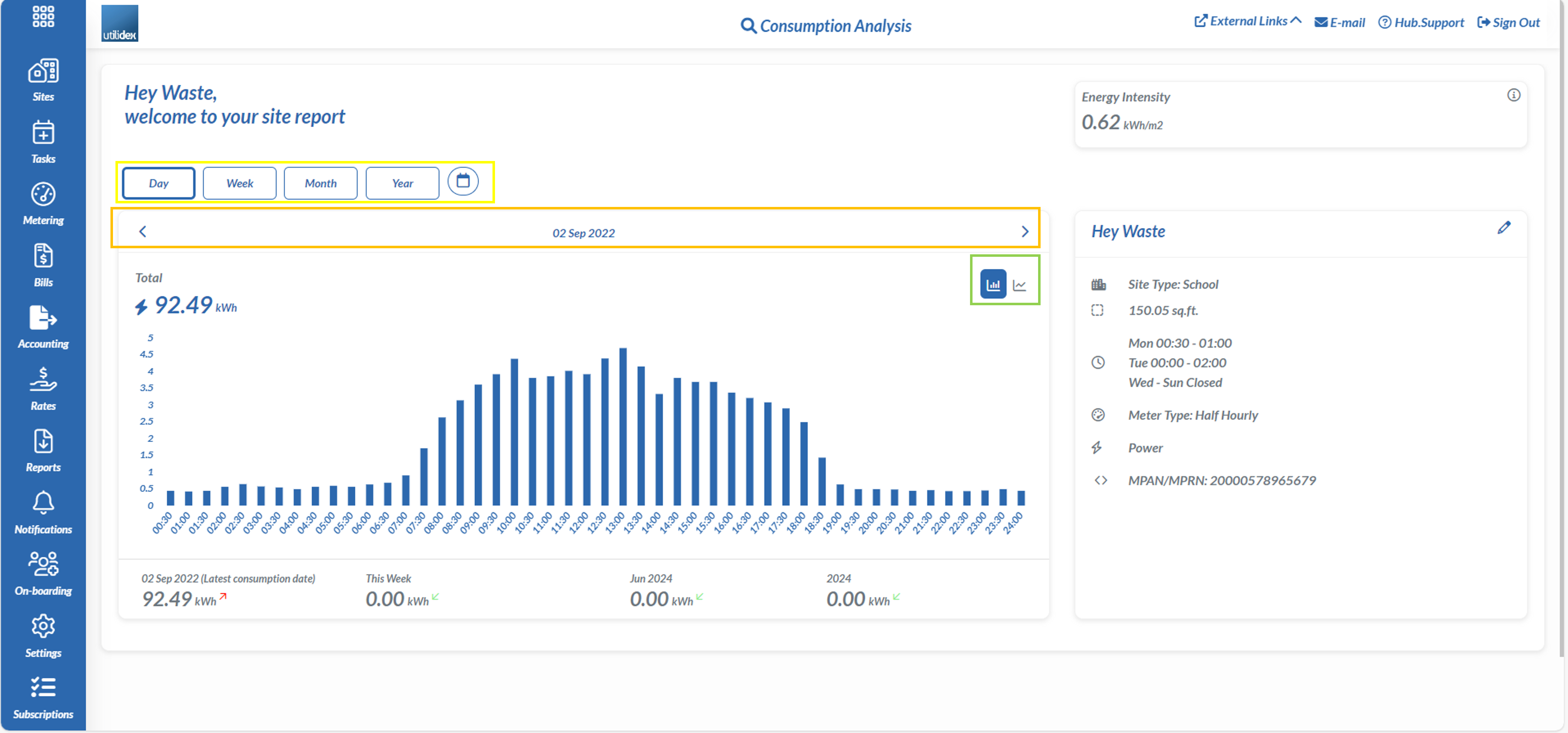
As seen in (fig c) the Graph will allow you to filter the following:
Yellow – Select Day, Week, Month, Year or a specific time period in the calendar
Orange – Click on the arrows to move backward or forward a specific time period (either day, week, month or year).
Green – Change the graph to either view a bar or area chart
(fig d)
Understanding KPIs
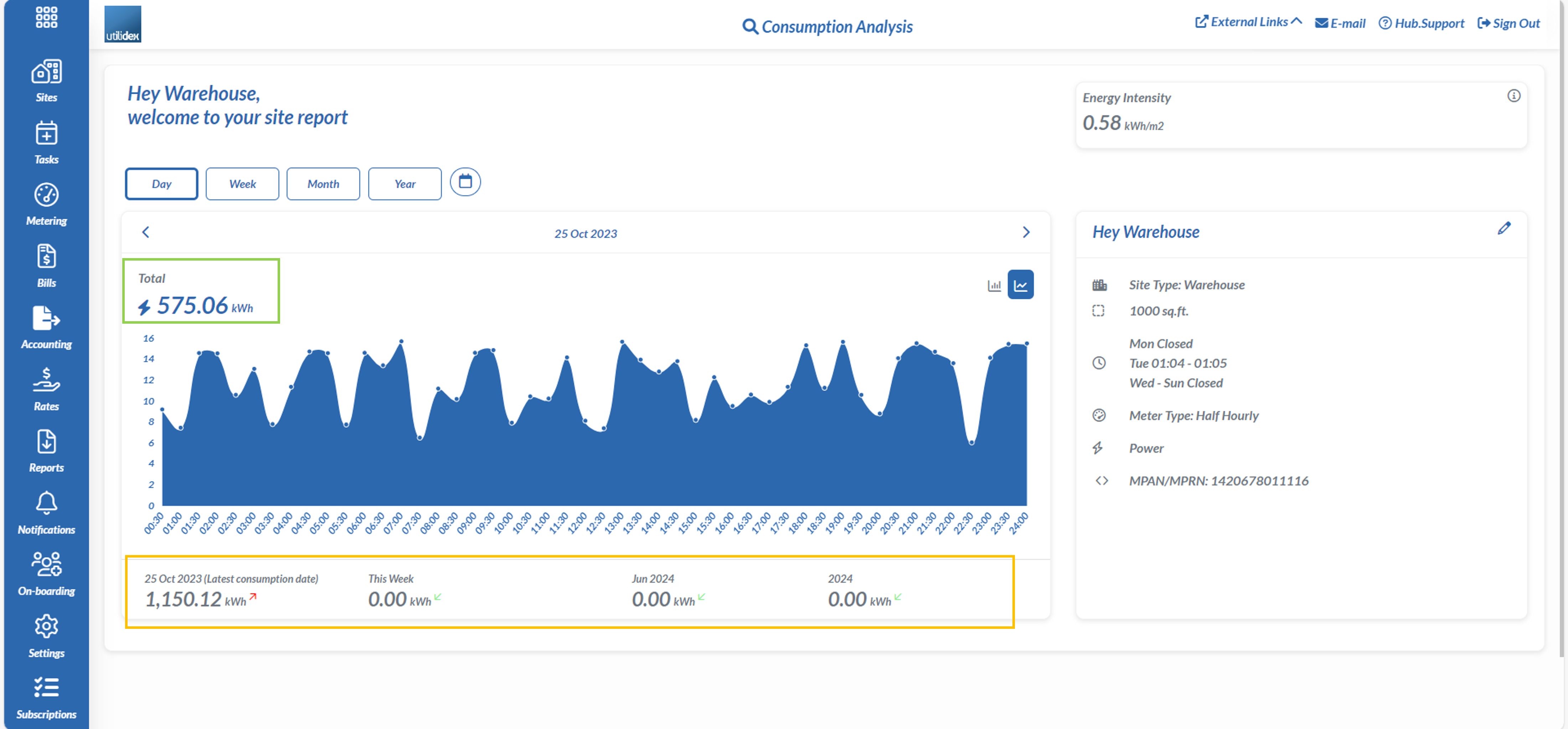
One last piece is understanding what each KPI on the graph means as seen in (fig d)
Green – Depending on your time period selection (i.e. Day, Week etc.) the total kWh will show the total for that period, and indicate a red arrow for increase or green arrow for decrease in consumption from the previous period.
Orange – This section will show the total consumption for the day, the week, the month and year and use red or green arrows to indicate an increase or decrease in consumption compared to the previous day/week/month/year.
Sites Without Data
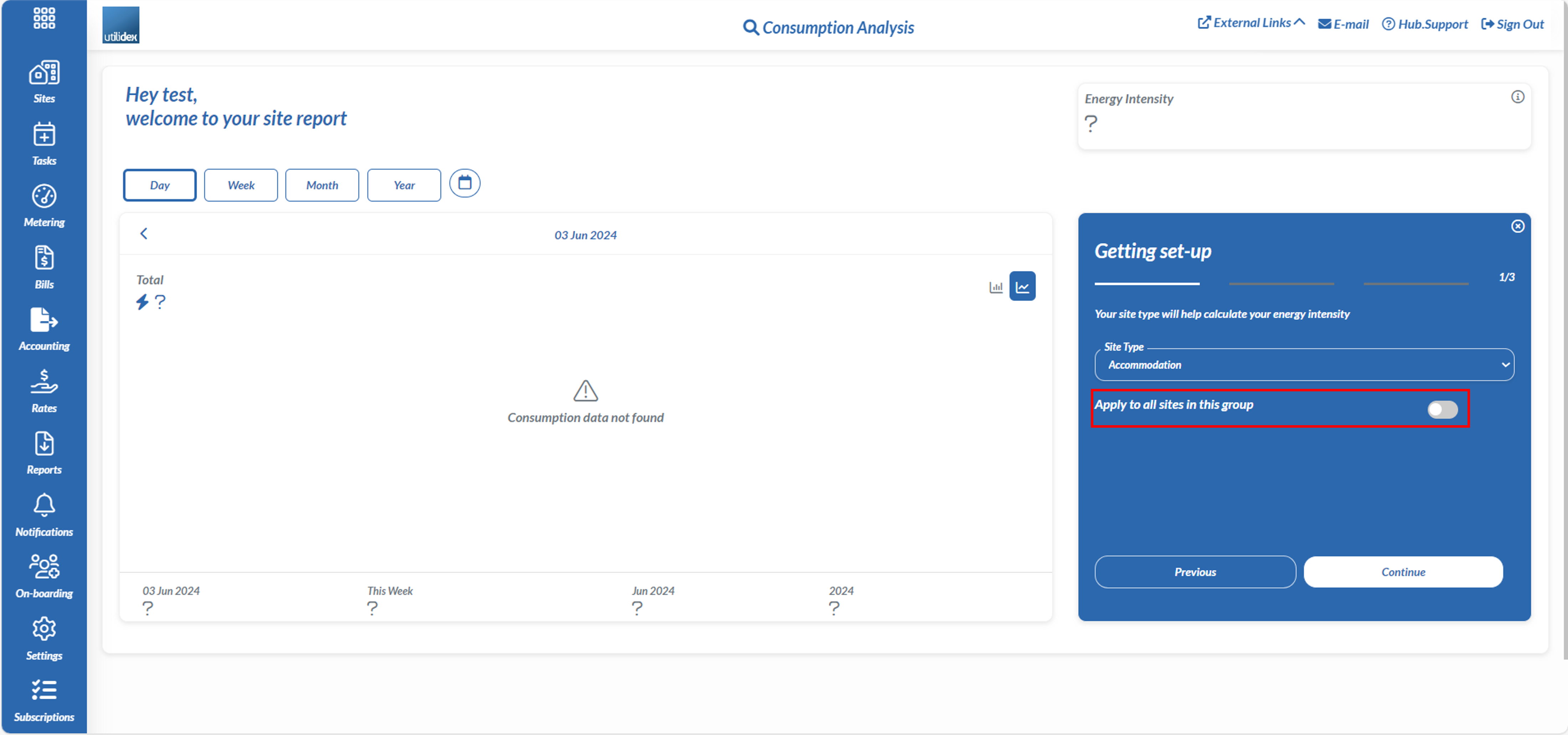
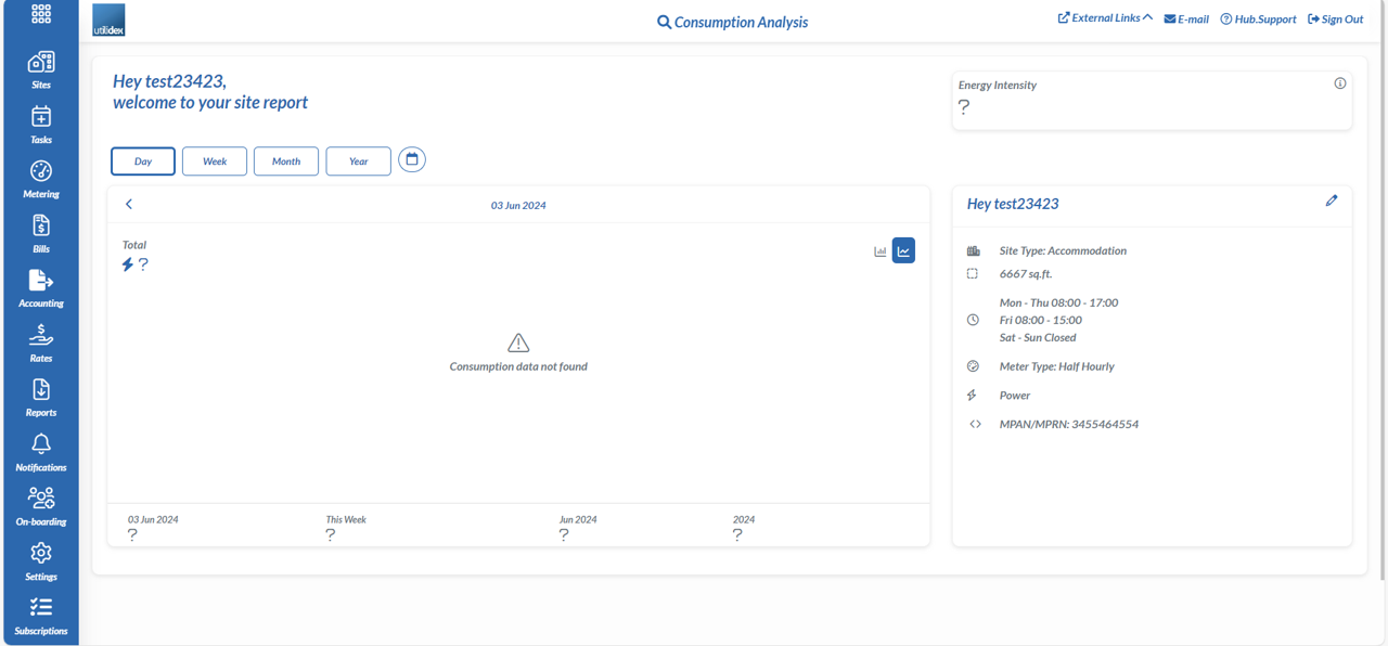
Sites that have no consumption data can still be accessed via the View Data Analysis page. However, when pressed a screen as seen in (fig e) will show up saying consumption data not found and the energy intensity will have a question mark when there is no data in the system.
(fig e)
Energy Intensity for all Groups
The data analysis section will calculate the energy intensity for all sites within a group. If you navigate to the right hand side of the page where it mentions ‘looking to learn more about your energy’.
(fig f)
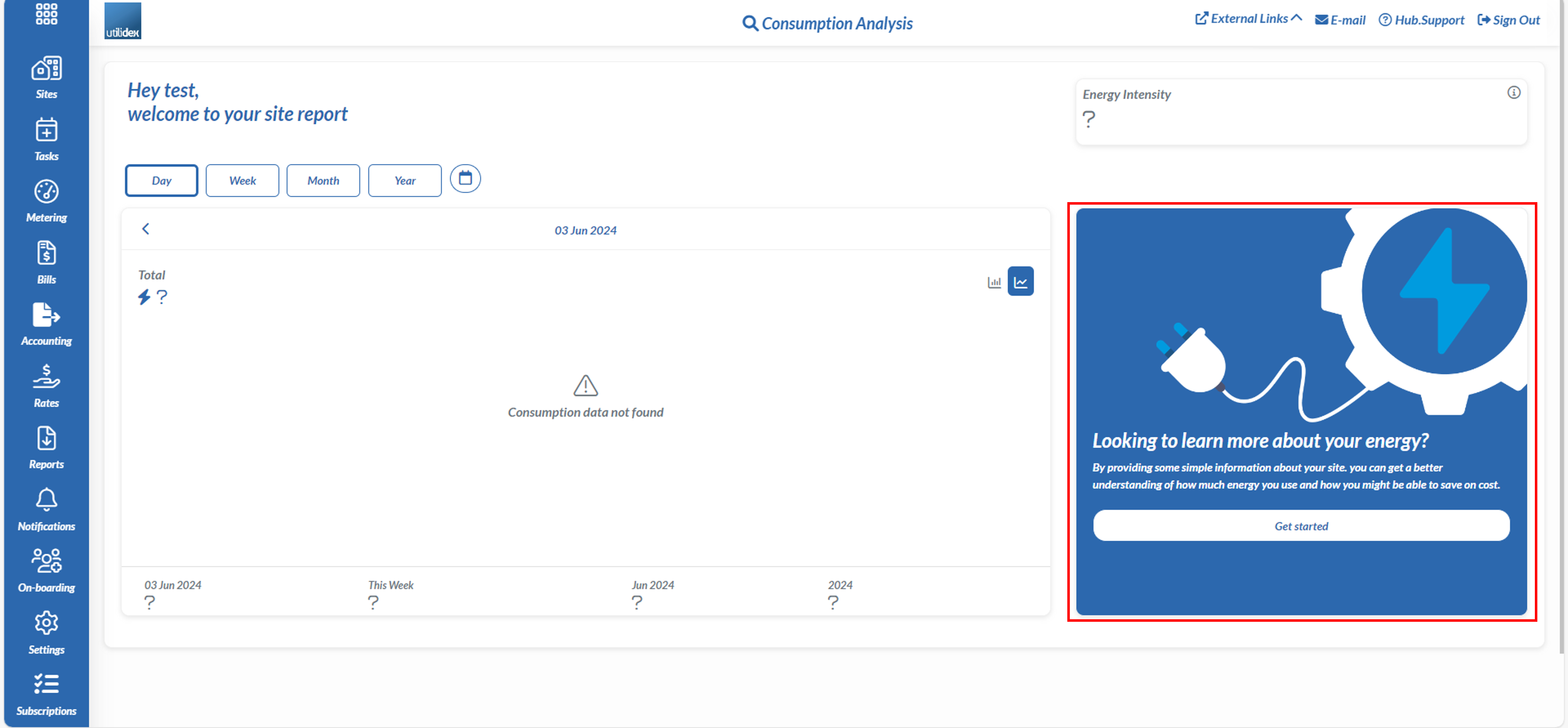
In this section you can change the Site Type, Site Area and the Opening and Close Hours for the site and if you hit the toggle where it says ‘apply to all sites in this group’ you can alter it for all sites within the respective group.
(fig g)
