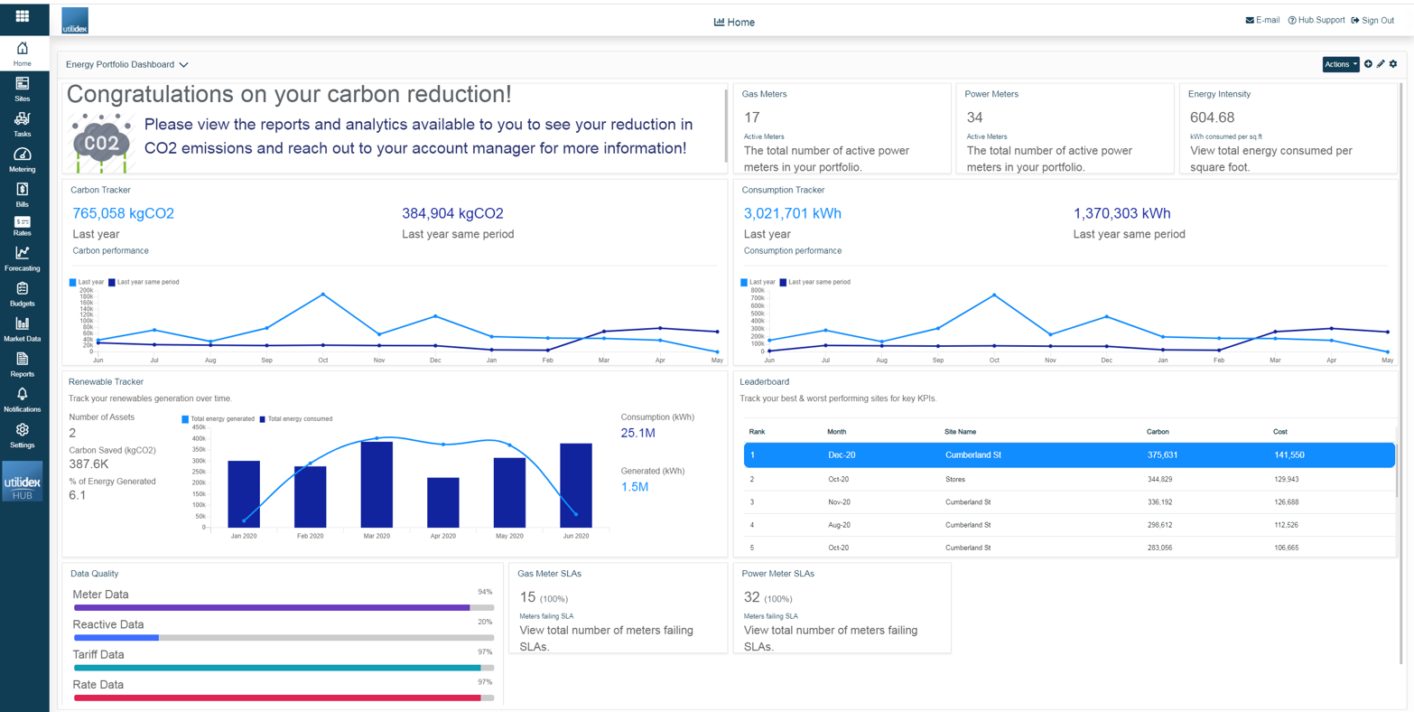
The Analytics dashboard is the screen you will arrive on when you first log into your Hub. You will see a number of widgets upon login, all of which are fully customisable, putting you in control of the visuals depending on your preferences. The widgets available will be dependent on the module’s you are subscribed to.
This page is all about bringing information together and making it easy to consume for everyday users. Displayed are Key KPI widgets using simple graphs & charts to visualise data that is intuitive for all users. Remember if you don’t like the screen layout, you can always change it!
There are multiple changes you can make to each widget, these are as follows:
- Resizing the widget
- Position them on the screen to your preference
- Configure each widget to display different groups, site(s), date ranges, and data sets
In this guide, we will cover changing the screen layout, searching through your widget library, changing the data filters as well as look into each of the available widgets.
How does it work?
As previously established the screen layout is fully customisable, to access the edit menu simply click on the pencil icon (top right corner). This will change your view and allow you to edit all elements in the screen below.
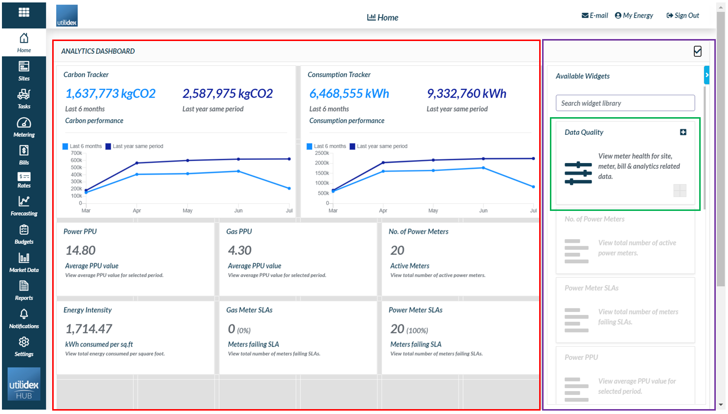
- The red section is where all your selected widgets are displayed. You can drag and drop the boxes within the screen or resize them depending on your preferences.
- The purple section is where all your available widgets can be found, under what we call a widget library. You can browse available widgets or search for specific ones.
- The green section is an example of a widget. The structure is always the same: name, description & the option to add to your landing page (just click on plus icon on the top right corner.
Renewable Tracker
The Renewable Tracker enables you to easily see and promote how much generation was produced and what that means in carbon savings
This widget displays in a graph your total energy consumption and total energy generation (kWh). This tracker displays KPIs around the total number of assets selected, the percentage of clean energy generated (kWh) and how much carbon (kgCO2) was saved.
Please see below the filters you can choose to customise the widget:
- Title
- Short description
- Colours for Graph
- Date Range
- Group & Site name
- Asset Type & Asset Name
![]()
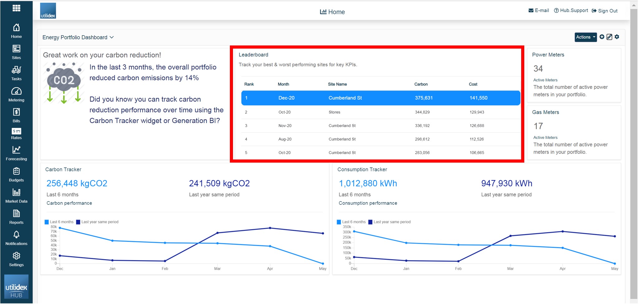
Leaderboard
The Leaderboard widget gives you the possibility to view which of your sites is performing better in terms of Cost, Consumption and Carbon.
This widget gives you an overview of each site’s performance in terms of Consumption (KWh), Carbon (kgCO2) and Cost (£) according to the period you selected.
Please note that the data will be populated according to the report “Key KPI Data”. You will be able to choose the specific columns you would like to show in the widget according to the available fields in the report.
Please see below the filters you can choose to customise the widget:
- Title & Description
- Available & Selected fields
- Sorting (ascending/descending)
- No. of records
- Date range
- Group & Site name
- Commodity
Editable Text Box
As a user, you may wish to add a text to the dashboard, which could be either a title or a description, e.g. a Site Title at the top of the dashboard, or some text, e.g. “Well done, this week in your energy savings – keep up the good work”. You will be able to specify the title, image and main text as it is shown in the right side of the image below, by simply clicking on the settings icon that appears when hovering over the widget. You will also be able to change the colours & fonts sizes.
Please see below how this may look like in your dashboard.
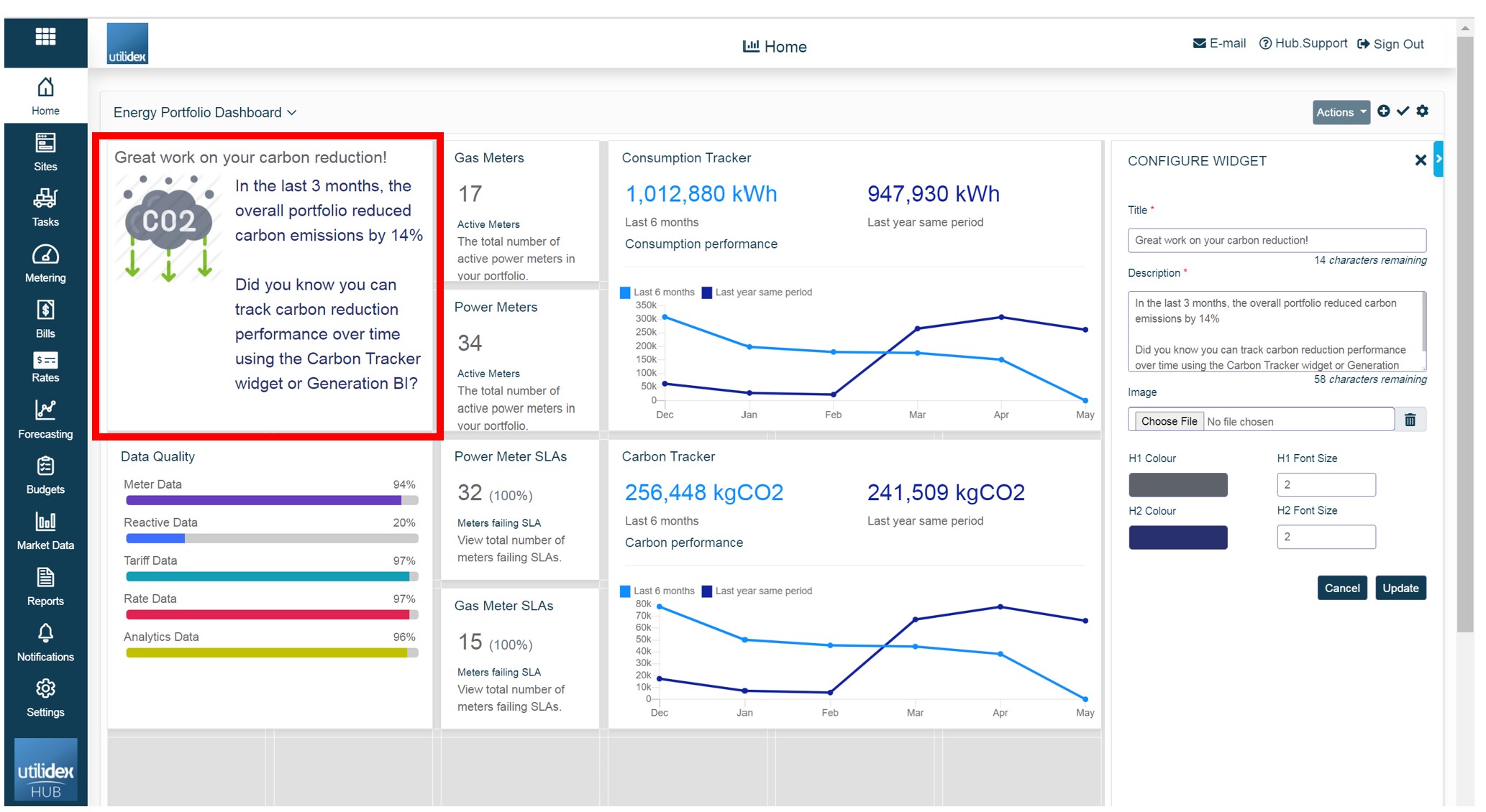
Note: when you will add the widget to the dashboard for the first time, you will need to configure the widget by clicking on the setting icon that appears when hovering over the widget.
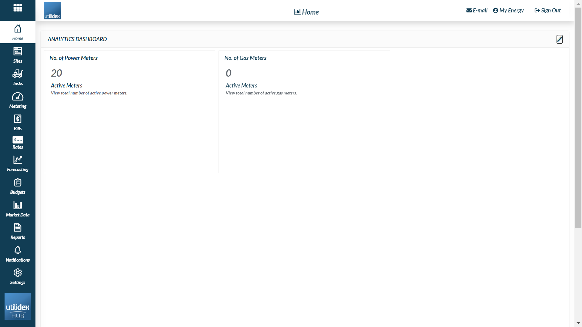
Power and Gas meters
The power and gas site widgets provide a quick snapshot of your portfolio. It counts the number of HH power/gas sites which are active.
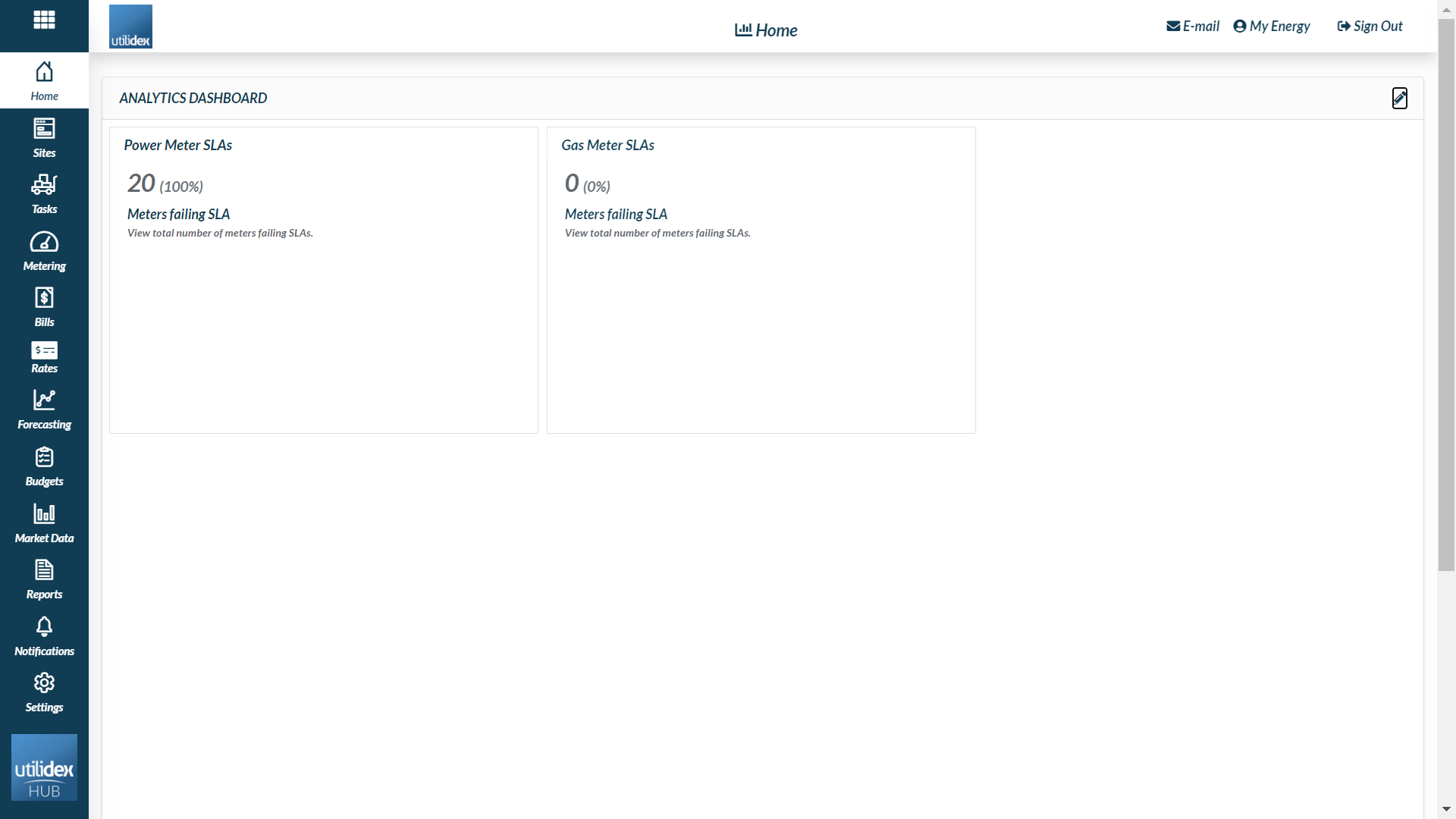
Power and Gas SLA Meter
This widget helps you track SLAs breached for metering, allowing you to target specific meters/metering providers/suppliers to fix your meter data. It displays the Count and % of Meters failing SLAs. You can change and set your Power and gas SLAs navigating to Metering >> Manage SLAs.
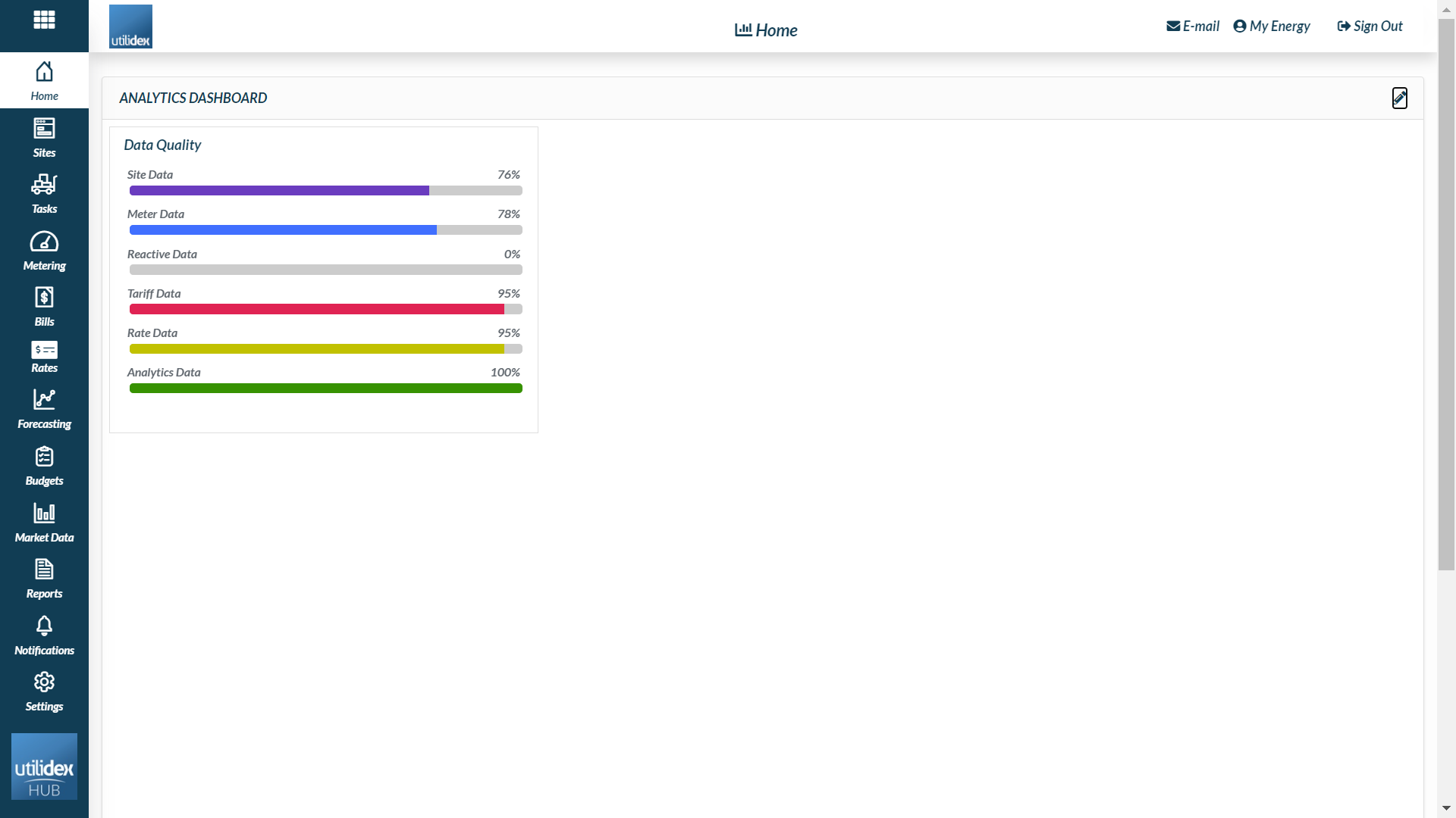
Data Quality
The data quality widget is a very important tool to understand the quality of your meter data. It displays your portfolio health and whether you have the right data to perform reporting/analytics/validation.
There are a number of data quality results displayed:
- Site Data completeness
- Meter Data completeness
- Tariff Data completeness
- Reactive Data completeness
- Rate Data completeness
- Analytics Data completeness
There are a range of filters available to allow you to customise the widget to you preference:
- Date range (This Month, Last Month, Last 3 Months, Last 6 Months, Last Year or select period)
- Group
- Site
- Commodity
- Type of data you want to check the quality.
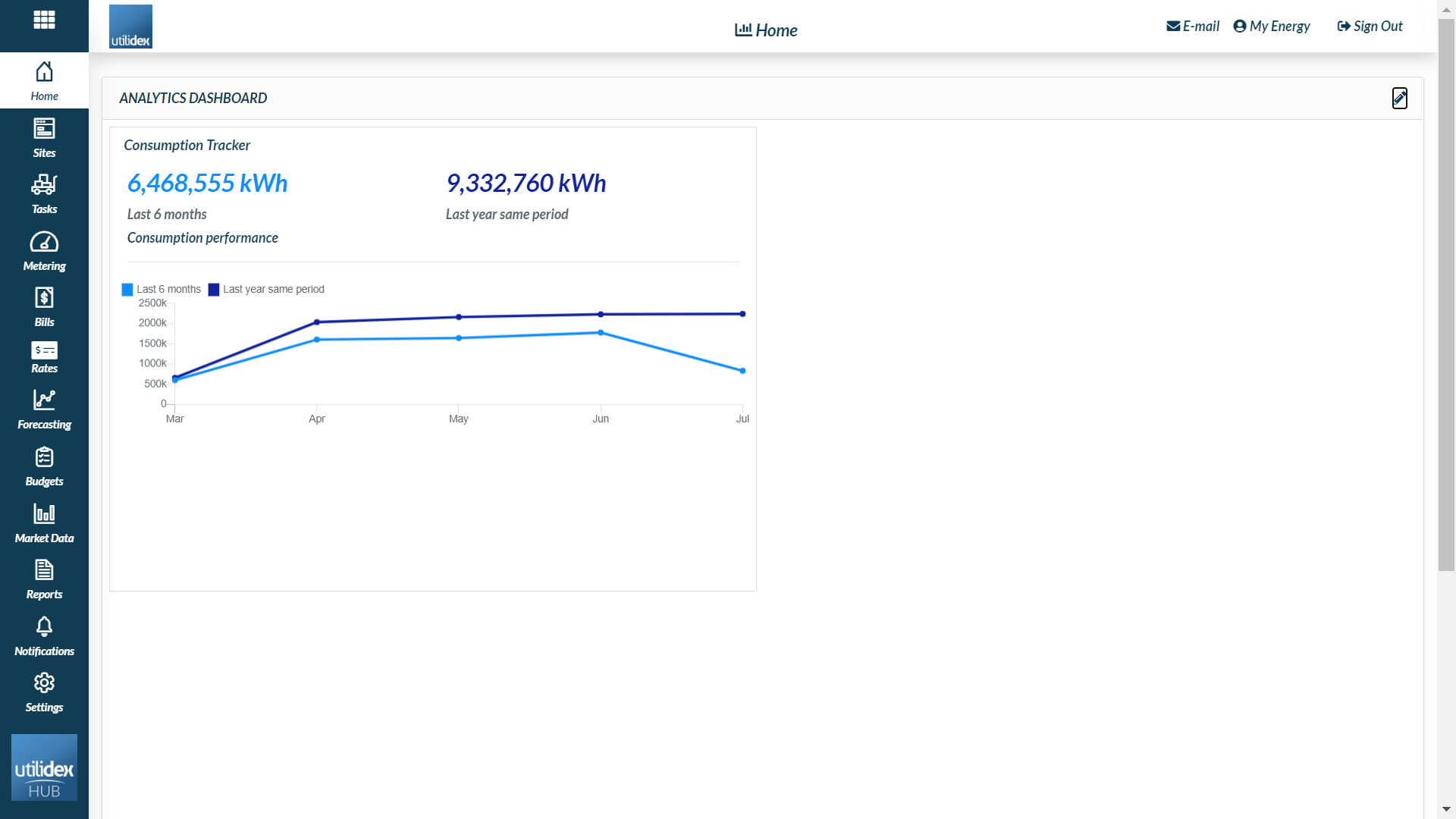
Consumption
This widget allows you to compare & benchmark your consumption data against previous years. Track & monitor your consumption patterns to understand your energy demands.
It shows the HH consumption for the period selected, and for the same period last year, e.g. if last 6 months is set, it would be the last 6 months, and the same last 6 months, one year earlier.
There are a range of Filters available to allow you to customise the widget to your preference:
- Title
- Description
- Colours
- Date Range (This Month, Last Month, Last 3 Months, Last 6 Months, Last Year or select period)
- Group
- Site
Power and Gas PPU
This Power widget provides a quick snapshot of your portfolio PPU for a selected period.
Top tip: change between 3, 6 & 12 month intervals to see how your PPU is affected by the seasons.

Carbon
This widget allows you to compare & benchmark your carbon data against previous years. Track & monitor your carbon patterns to understand your energy demands. For a more detailed comparison please see the Power BI. This shows the Carbon this Period and Last Period.
There are a range of filters available to allow you to customise the widget to your preference:
- Title
- Description
- Colours
- Date Range (This Month, Last Month, Last 3 Months, Last 6 Months, Last Year or select period)
- Group
- Site

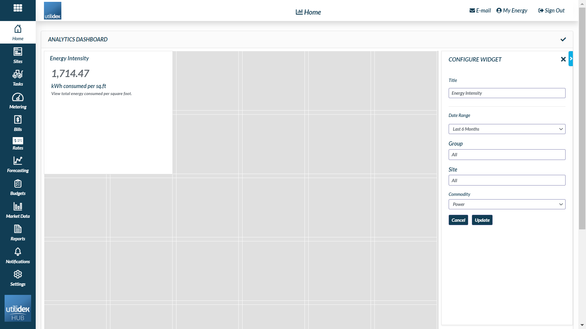
Energy Intensity
This provides a quick snapshot of your portfolio’s Energy Intensity for a selected period.
Top tip: change between 3, 6 & 12 month intervals to see how your Energy Intensity is affected by the seasons.
There are a range of filters available to allow you to customise the widget to your preference:
- Title
- Date Range (This Month, Last Month, Last 3 Months, Last 6 Months, Last Year or select period)
- Group
- Site
- Commodity
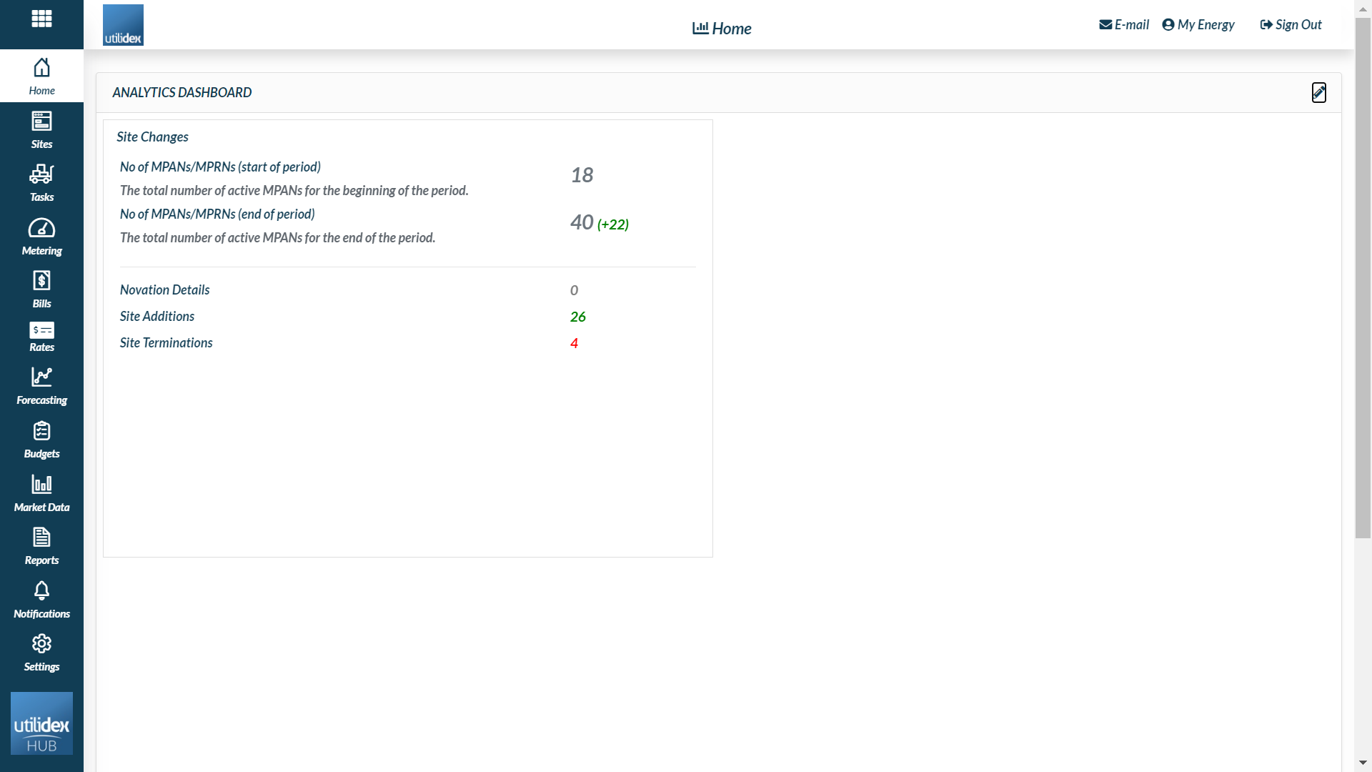
Site changes
This widget gives you an overview of how much your portfolio has changed in a determined period.
You can filter by commodity and date range.