Overview
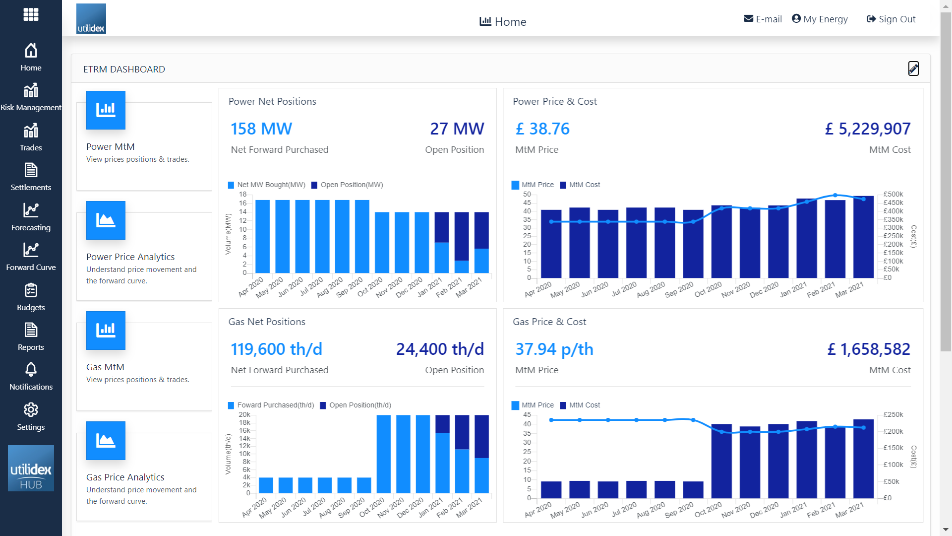
The ETRM Dashboard is the screen you will arrive on when you first log into your Hub. You will see a number of widgets upon login, all of which are fully customisable, putting you in control of the visuals depending on your preferences. The widgets available will be dependent on the module’s you are subscribed to.
This page is all about bringing information together and making it easy to consume for everyday users. Displayed are Key KPI widgets using simple graphs & charts to visualise data that is intuitive for all users. Remember if you don’t like the screen layout, you can always change it!
In this page you can view the Power/Gas Net Positions, the Power/Gas Price & Cost, and the different widgets that direct you to the Price Analytics and MtM BI reports.
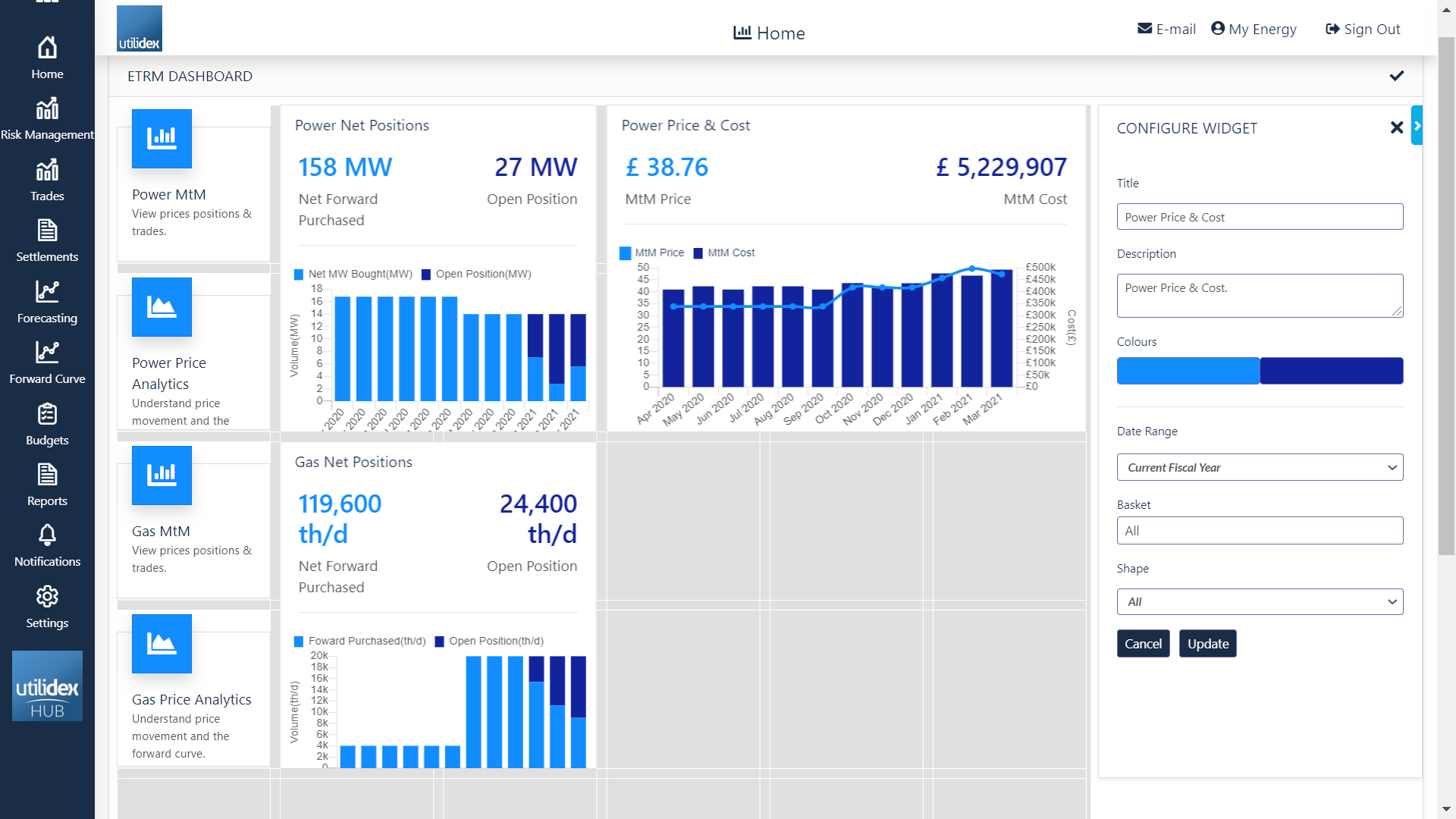
There are multiple changes you can make to each widget, these are as follows:
- Resizing the widget.
- Position them on the screen to your preference.
- Configure each widget to display different groups, site(s), date ranges, and data sets.
How does it work?
As previously established the screen layout is fully customisable, to access the edit menu simply click on the pencil icon (top right corner). This will change your view and allow you to edit all elements in the screen below.
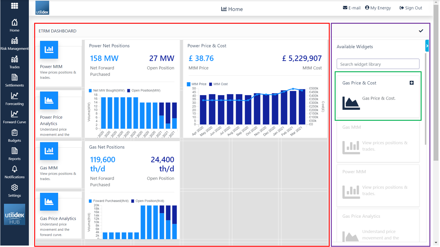
- The red section is where all your selected widgets are displayed. You can drag and drop the boxes within the screen or resize them depending on your preferences.
- The purple section is where all your available widgets can be found, under what we call a widget library. You can browse available widgets or search for specific ones.
- The green section is an example of a widget. The structure is always the same: name, description & the option to add to your landing page (just click on plus icon on the top right corner). Here you can filter per date range, basket and shape as shown below.